
Maggie Dana
-
Posts
136 -
Joined
-
Last visited
Content Type
Profiles
Forums
Events
Books
Everything posted by Maggie Dana
-
That is so nice. Authors LOVE stuff like this, and I agree about signatures. I've been lucky enough to have quite a few of my favourite authors sign my favourite books. It really does make them even more precious than they already are.
-
Talisman: You must be really pleased with this. Well done to have had the foresight to make a significant change to your cover, and to add more pages, plus the endorsements. Every little bit helps, and in this rotten economy, authors need all the help they can get! Maggie
-
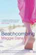
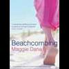
I've always known covers were important, but had no idea until last month, that major booksellers (in this case, Waterstones) actually had a major influence on covers prior to publication. Case in point: my own cover. My publisher had sent me the original version last September, but when I saw it displayed recently on Amazon and other sites, it was a little different than the version I saw. The sky was no longer beige like the sand, it was pale blue, and the woman's dress was a deeper, richer shade of pink. Apparently, all of Macmillan's covers (and probably those of other publishers) are run by the folks at Waterstones first. If they suggest changes, changes are made. In my case, Waterstones said the cover wasn't colourful enough. Clearly, booksellers have more clout in this area than do authors. I have to hope they know from whence they speak!
-
What do you want on the shelves?
Maggie Dana replied to Christie's topic in General Book Discussions
Well said, nicnic. I'm with you on this one. -
Hi Linda: I loved UP ISLAND and think it's Siddons's best novel. Her recent ones don't appeal the way her older books do. As for Blyton and the Fives and Adventure series ... I gobbled those up as a kid and when I moved to the States and had my own kids, I was dismayed to find they're not published here. Not even now ... so I buy them via the Book Depository for my grandchildren, another generation of Blyton lovers. The coastline of UP ISLAND (Martha's Vineyard) is similar to the settings I used for BEACHCOMBING. The shoreline of this part of the States (northeast) is gorgeous, and each state has its own flavour: from the long, rocky beaches of Maine to the sand dunes on Cape Cod and the islands. The photos I took for my web site's banner were taken within a mile or two of where I live (Connecticut). Talking of 'long, rocky beaches' always reminds me of a favourite song: "Time in New England." Love that one, even if it is a bit schmaltzy.
-
Have you ever cried (with laughter?)?
Maggie Dana replied to rmontoro's topic in General Book Discussions
Bryson makes me howl and can no longer trust myself to read him in the company of strangers. It's a rare piece of fiction that makes me laugh out loud, never mind cry with laughter, and that's because humourous fiction is far harder for an author to pull off than is humourous non-fiction. That said, I had quite a few chuckles recently while reading Linda Gillard's STAR GAZING. They were all the more precious, given the serious premise of the novel, i.e., a blind protagonist. -
Have you ever cried (with laughter?)?
Maggie Dana replied to rmontoro's topic in General Book Discussions
Reading this just now made me sad ... all for a fictional character in a book I've not even read. -
Having loved Star Gazing, I loaned it to a friend; she just rang to say how much she enjoyed it, that she keeps thinking about the story and the characters and especially about Scotland and Skye. I've also just finished reading Emotional Geology and while I loved that one as well, I liked SG better. Something about that Keir really got to me, and I found Louisa and Garth positively endearing. Made me laugh out loud several times, and that sort of humour isn't easy for a novelist to pull off. And thanks again, Linda, for sending them to me. Very much appreciated.
-
Welcome to the friendliest book site around. And was Michael Caine in the movie version of Cider House Rules, or am I thinking of another film?
-
What author would you marry and why?
Maggie Dana replied to Christie's topic in General Book Discussions
I'm grabbing Ken Follett before anyone else gets him, with Lee Child as a backup in case Ken puts up too much of a fight. -
Cooking with Fernet Branca by James Hamilton-Paterson
Maggie Dana replied to Freewheeling Andy's topic in General Fiction
Thanks, Andy. I thought my memory might be playing tricks (it often does) because it's been years since I heard that Cosby skit. -
Cooking with Fernet Branca by James Hamilton-Paterson
Maggie Dana replied to Freewheeling Andy's topic in General Fiction
Hmmm, and I always thought (courtesy of a very old Bill Cosby skit) that Fernet Branca was something to settle the stomach. -
And the dross will proliferate in the e-book world because these gadgets make it simpler and cheaper than ever to distribute dross. But they're going to be a boon to students ... soon as the technology catches up and textbooks can be displayed with graphics and in colour.
-
Finally, someone with a wide audience has put into words what I've been saying all along about Kindles and e-book readers: http://www.wired.com/gadgetlab/2009/05/e-book-design/
-
My more experienced colleagues, old-time book typesetters like myself who joined the business long before the desktop revolution of the mid-1980s, feel the way I do about fonts and readability. There are, however, some brilliant newcomers who're passionate about fonts and the nuances of type design, but you won't find those creative people designing a book's page. They're too busy designing the next gorgeous typefaces for me, and my typesetting colleagues, to salivate over. While aforementioned desktop revolution has been beneficial in so many ways by making it easier for people to communicate and share thoughts, etc., it's also been a scourge in that anyone with a personal computer and a few relatively affordable pieces of software can hang out a shingle that proclaims them to be a typesetter. There are no tests to pass, no certificates to obtain, no apprenticeships to serve. Add to this the fact that publishers are always looking at (and beyond) the bottom line, and you have people with little to no experience offering rock-bottom prices to manufacture a product that used to bear the extensive and thoughtful care of a battery of craftsmen and women who'd paid their dues in the typography business, and then some. Nowadays, many books (especially fiction) are typeset in third-world countries by people who don't speak our language, or if they do, they're non-native speakers. They are even hired for copy editing duties as well, which can result in some hilarious and inexplicable syntax, especially when the editor and author aren't scrupulous about double-checking what their copy editor has done.
-
The Perfect Summer: Dancing into Shadow in 1911 by Juliet Nicolson
Maggie Dana replied to rosegarden's topic in Non Fiction
I read this book last summer and enjoyed it so much I'm planning to read it again. It's a great way to absorb history without it feeling like work! Around the same time I also read King, Kaiser, Czar and together they painted a fascinating and personal portrait of an era that all too often is only portrayed in political terms. -
I agree. After Tenth Circle and 19 Minutes I wasn't eager to dive into Change of Heart, especially when I read the blurb about a man on death row for killing a child. In fact, it took me three tries to finally get into the book, and I'm so glad I did, because it turned out to be an excellent read. Not one of her best, but far better than the two that preceded it. I almost gave up on Handle with Care as well, but again, I'm glad I didn't. What initially turned me off was each character talking to Willow, using the third-person construct that I found mildly condescending and rather awkward. But I kept going and in the end I barely noticed it at all. It was a heart-wrenching story.
-
Chesil: You're quite right about fonts that work on paper (serif) versus those that work best on screen (sans serif). I'm reading Linda Gillard's STAR GAZING and loving it. It's a beautiful, well-written novel, with compelling characters and sparkling dialogue. My only complaint is the design. The two first-person POV narratives are set in sans serif; one of them (heaven help us) in a sans serif italic, which makes it even harder to read. Fortunately the book's gorgeous writing overcomes my irritation with the design, but it'd have been an even more enjoyable read had the book's designer used serif fonts throughout. I have the same issues with Jodi Picoult's multi-person POV novels. A jumble of fonts, including sans serif, that jar the eye. As soon as my article appears I'll post a link. I'm still waiting to hear from the blogger about it.
-
Anyone read The Five Find Outers by Enid Blyton?
Maggie Dana replied to Christie's topic in Children's / Young Adult
What age group are the Five Find Outers written for? I grew up loving the Fives books, Mallory Towers, and the 'Adventure' series, but I never came across the Five Find Outers. My daughter and now her children love Enid Blyton too, and I'm always on the lookout for more. I've lived in the States for many years and have recently discovered the Book Depository with its free shipping, so Enid Blyton books are much more affordable now. -
A subject close to my heart: books and readability, or lack thereof. As a book designer and typesetter (and author), I've been ranting about this for years, and am in the midst of writing an article about it for a UK-based blog about editing and publishing. Here are my opening paragraphs: * * * Pinned to my notice board is a sticky note that says: A typographer
-
Welcome, Wiggywoo ... and what a great name! Reminds me of 'Tricky-woo,' a dog in Herriott's wonderful tales and 'Tigger too.'
-
Besides the fabulous and insightful reviews on this site, what other online book review sites do you read?
-
These days you CAN judge a book by its cover. It's designed to make you pick the book up, which is why publishers pay a lot of money for them. The choice of colours, font, and graphics is hugely important, especially when the author is unknown or the book hasn't had a big publicity push and glowing reviews. Of course, it never hurts to peek inside and read a few paragraphs to make sure you're on board with that particular author's style.
-
Anyone read the Young Bond Series?
Maggie Dana replied to Christie's topic in Children's / Young Adult
I'm in States and have been looking for Bond books for young readers. What age group are these aimed at? -
I'm a freelance book designer and typesetter and I work with production editors who're far less glamourous than the 'editors who do lunch.' We're the folks who take a raw, unedited manuscript and turn it into a real book with typeset pages, pretty covers, and even that lovely new book smell some readers rave about.